
The Metrics tab inside the Deal Drawer provides three synchronized time-series charts that give you a visual health check on any deal. All charts share a unified weekly X-axis that starts at the deal’s creation date and ends at either today or the date the deal was closed.
How to Access
Open any deal from your pipeline, then click the Metrics tab (the fifth tab in the Deal Drawer). Charts populate automatically as you work the deal—no setup required.

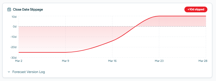
Close Date Slippage
This area chart tracks how much your expected close date has shifted over time, measured in days. When you create or update a Sales Cycle, the system records a version snapshot. The first version establishes a 0-day baseline, and every subsequent change shows the cumulative shift.
- Positive values (red shading) indicate the close date has slipped later than originally planned.
- Zero or negative values mean the deal is on track or ahead of schedule.
The KPI card above the chart shows total slippage days and the number of forecasts recorded.
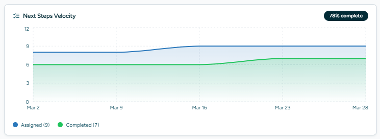
Next Steps Velocity
This area chart visualises how quickly next steps are being created and completed each week. Two data series are shown:
- Created — next steps added during the week.
- Completed — next steps marked done during the week.
A healthy deal will show completed steps keeping pace with (or exceeding) created steps. The KPI card shows total completed steps and the completion rate as a percentage.
Deal Value
This step-after line chart tracks how the deal’s monetary value has changed over time. Three lines are displayed:
- Total (dashed dark line) — the combined deal value, always the top line.
- Subscription (blue line) — recurring revenue components.
- Non-Subscription (orange line) — one-time or variable components.
The KPI card shows the current total value and the net change since the deal was created.
Version Logs
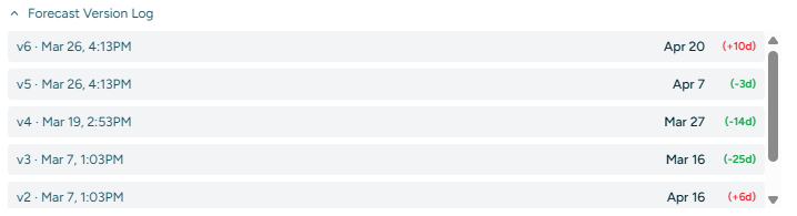
Each chart includes a collapsible log that lists every recorded change in chronological order. Logs display colour-coded delta (Δ) values so you can see exactly when and by how much each metric shifted. Click the log header to expand or collapse.

Closed Won / Lost Markers
When a deal reaches a final outcome, a vertical reference line appears on all three charts at the corresponding date. Won deals show a green marker; lost deals show a grey marker. The timeline caps at this date so charts remain focused on the active selling period.
Tips
- Charts begin populating as soon as you create a Sales Cycle or add value components—there is no minimum data requirement.
- The Expected Close Date shown in the Deal Drawer is the single source of truth. The Sales Cycle Planner writes to this field and versions are recorded for slippage tracking.
- Use the Metrics tab during pipeline reviews to quickly spot deals that are stalling or losing value.